In diesem Blogbeitrag geht es um die Visualisierung von Daten; genauer gesagt um das Erstellen eines Balkendiagramms mit Python und bokeh. Im Gegensatz zu vorherigen Beispielen liegt der Datensatz in diesem Fall als CSV-Datei vor, die mit pandas gelesen wird.
Damit dies funktioniert, sind folgende Pakete mit pip zu installieren:
$ pip pandas bokeh  # Windows
$ pip3 pandas bokeh # Linux, macOS
Dann kann es auch schon an den Code gehen. Den Anfang mach folgende Import-Anweisungen:
import pandas as pd
from bokeh.plotting import ColumnDataSource
from bokeh.plotting import figure
from bokeh.plotting import show
from bokeh.plotting import output_file
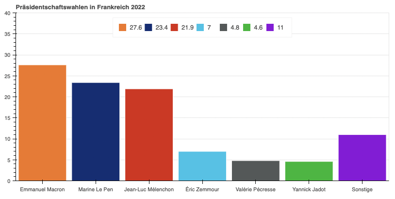
from bokeh.transform import factor_cmapDer Inhalt der CSV-Datei „election-presidentielle-2022.csv“ sieht folgendermaßen aus:
Kandidat;Ergebnis
Emmanuel Macron;27.6
Marine Le Pen;23.4
Jean-Luc Mélenchon;21.9
Éric Zemmour;7.0
Valérie Pécresse;4.8
Yannick Jadot;4.6
Sonstige;11.0
Zunächst sollen diese Daten gelesen werden; dazu wird pandas genutzt:
# Read csv data using pandas
df = pd.read_csv(
    "election-presidentielle-2022.csv",
    sep=";")
Die Daten der beiden Spalten werden anschließend den Variablen candidates und results zugewiesen. Darüber hinaus wird eine weitere Liste mit den Farben erstellt, die später für die Balken verwendet werden sollen.
candidates = df["Kandidat"]
results = df["Ergebnis"]
palette = [
    "#E47C2F",
    "#142D73",
    "#C93A1F",
    "#5AC1E6",
    "#545858",
    "#53B53D",
    "#7E1ED7"]
Weiter geht es mit der Festlegung der Datenquelle:
# Data source
source = ColumnDataSource(data=dict(candidates=candidates, results=results))
Im Ergebnis werden wir eine HTML-Datei erhalten. Diese soll den Titel „Election présidentielle 2022“ erhalten:
# output file
output_file(
    filename="election-presidentielle-2022.html",
    title="Election présidentielle 2022")
Jetzt ist es an der Zeit Breite, Höhe und Titel für unser Balkendiagramm festzulegen:
plt = figure(
    x_range=candidates,
    width=800,
    height=400,
    toolbar_location=None,
    title="Präsidentschaftswahlen in Frankreich 2022",
)
Für das Erstellen des Balkendiagramms (vbar) werden noch einige weitere Angaben benötigt, z.B. zur Legende oder zu den Farben der Balken:
plt.vbar(
    x="candidates",
    top="results",
    width=0.9,
    source=source,
    legend_field="results",
    line_color="white",
    fill_color=factor_cmap("candidates", palette=palette, factors=candidates),
)

plt.xgrid.grid_line_color = None
plt.y_range.start = 0
plt.y_range.end = 40
plt.legend.orientation = "horizontal"
plt.legend.location = "top_center"

show(plt)
Hier der vollständige Code, den Ihr kopieren und als Ausgangspunkt für Eure eigenen Balkendiagramme verwenden könnt:
#!/usr/bin/env python3

"""
Election presidentielle 2022
Python 3.10+
Date created: July 10th, 2022
"""


import pandas as pd

from bokeh.plotting import ColumnDataSource
from bokeh.plotting import figure
from bokeh.plotting import show
from bokeh.plotting import output_file
from bokeh.transform import factor_cmap


# read csv data using pandas
df = pd.read_csv(
    "election-presidentielle-2022.csv",
    sep=";")

candidates = df["Kandidat"]
results = df["Ergebnis"]
palette = [
    "#E47C2F",
    "#142D73",
    "#C93A1F",
    "#5AC1E6",
    "#545858",
    "#53B53D",
    "#7E1ED7"]

# data source
source = ColumnDataSource(data=dict(candidates=candidates, results=results))

# output file
output_file(
    filename="election-presidentielle-2022.html",
    title="Election présidentielle 2022")

# width, height and title
plt = figure(
    x_range=candidates,
    width=800,
    height=400,
    toolbar_location=None,
    title="Präsidentschaftswahlen in Frankreich 2022",
)

# configure bar chart
plt.vbar(
    x="candidates",
    top="results",
    width=0.9,
    source=source,
    legend_field="results",
    line_color="white",
    fill_color=factor_cmap("candidates", palette=palette, factors=candidates),
)

plt.xgrid.grid_line_color = None
plt.y_range.start = 0
plt.y_range.end = 40
plt.legend.orientation = "horizontal"
plt.legend.location = "top_center"

show(plt)